Insightfull Agency

INSIGHTFULL

Gilgal Startegy, A Case Study: Rooted in Meaning, Refined in Form

The Challenge

Gilgal Strategy, a strategic advisory firm, needed a visual identity that not only reflected its purpose but also resonated deeply with its clients. The name “Gilgal,” a biblical term signifying a “turning point, a symbol of preparation and renewal,” was a foundational element. The challenge was to translate this rich, spiritual meaning into a sophisticated and clean design that would appeal to a diverse clientele, from faith-based organizations to secular businesses.

Our Approach

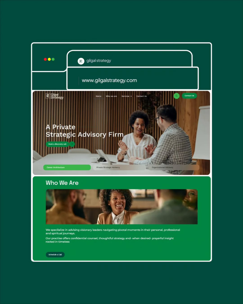
We embarked on a journey to craft a visual identity that was both meaningful and modern. The design was meticulously shaped around the core concept of a turning point—a moment of transition and clarity. We focused on clean lines, intentional negative space, and a color palette that evokes a sense of calm and trust. Every element, from the logo to the typography, was chosen to be a quiet, yet intentional, reflection of the firm’s purpose.

The design philosophy was simple: “Rooted in meaning. Refined in form.” We ensured that the visual identity, while subtle, would powerfully communicate Gilgal Strategy’s commitment to guiding leaders through their personal, professional, and spiritual journeys.

The Result

The new Gilgal identity extends across all touchpoints, from the website (www.gilgalstrategy.com) to their client-facing products. The brand now speaks with a unified voice, a quiet but confident reflection of its mission. The visual identity successfully bridges the gap between the firm’s deep-rooted principles and its professional, strategic services, serving as a constant reminder of the transformative journey they facilitate for their clients.

This case study is a testament to the power of a purpose-driven design—one that goes beyond aesthetics to tell a story and build a connection.